
SelectHealth.org
Role
Lead Digital Experience Designer
Skills
User Research, Data Analysis, Personas, Branding, UX Design, Prototyping, Web Development
Project Type
Company Project
Timeline
Sept 2019 - April 2021
Tools Used
Sketch App, Adobe Photoshop, Adobe Illustrator, InVision, HTML & CSS, Angular, Material Design
Platform
Responsive Website
Project Summary
In collaboration with the Marketing team I worked to create a website that would be a better user experience for potential members.
After launching SelectHealth.org in 2017 user research indicated that there is a strong desire for customers to be more educated in health insurance to make an informed decision.
Although the information was there they wanted it fast with minimal number of clicks.
SelectHealth had a growth initiative that the Digital Experience team felt we could support. With that, I added more sales focused content and CTAs on the new website to drive customers to commit to Selecthealth at Open Enrolment.
Given these objectives, I designed and developed a responsive website that allows users to get information fast, signup for reminders and simple enrollment.
Design Process
I followed five-phase design thinking process to assist with the need for the stakeholders.
- Empathize
- Meet with stakeholders to talk about project needs
- Conduct user research
- Competitor analysis and analytics
- Define
- Define problem area
- Ideate
- Design System (material design)
- Style Guide (e.g. color scheme, logo, fonts, buttons)
- Finalize digital product ideas
- Prototype
- Illustrate icons
- Wireframes
- Hi-Fidelity mock-ups
- Test
- On-going tests with users
- User experience Questionnaires
User Research
We conducted online surveys with SelectHealth individuals in Idaho and Utah, where our members live. From these we found from the data:
- We have a very broad range of user with different technical backgrounds and feeling about health insurance.
- Some users have low interest and get health insurance because the need too. Whereas some like to learn a lot of information before the make a decision but ultimately everyone wants the information easy to understand and accessible.
- Our customerrs prefer bulleted lists as they feel it makes the content easier to digest.
Personas
From user research, I created multiple personas based on the main groups that would be shopping the website.
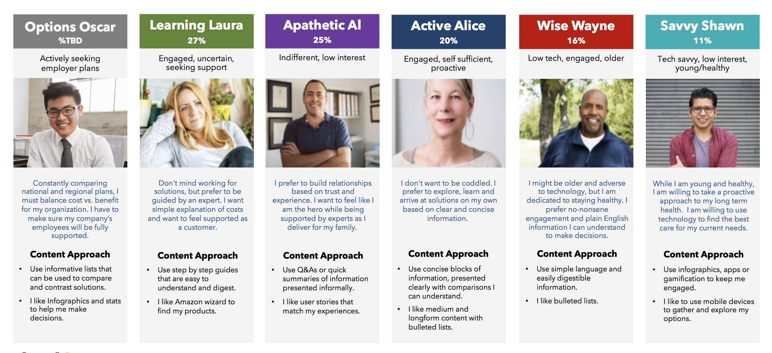 Personas
Vision and Design System
SelectHealth already has branding in place. So, with this I decided to use this as a base for the design system. I used material design as a base for the system and updated the color schemes etc. to match our branding. This gave us a good foundation for the website.
We wanted to continue using elements that had already been established by marketing but make them more suitable for a CMS system. With that said, we created a website guide that included various reusable components with a variety of options including typography, buttons, colors and where a good place to use these would be.
 Medicare Look and Feel
 Forms
Forms
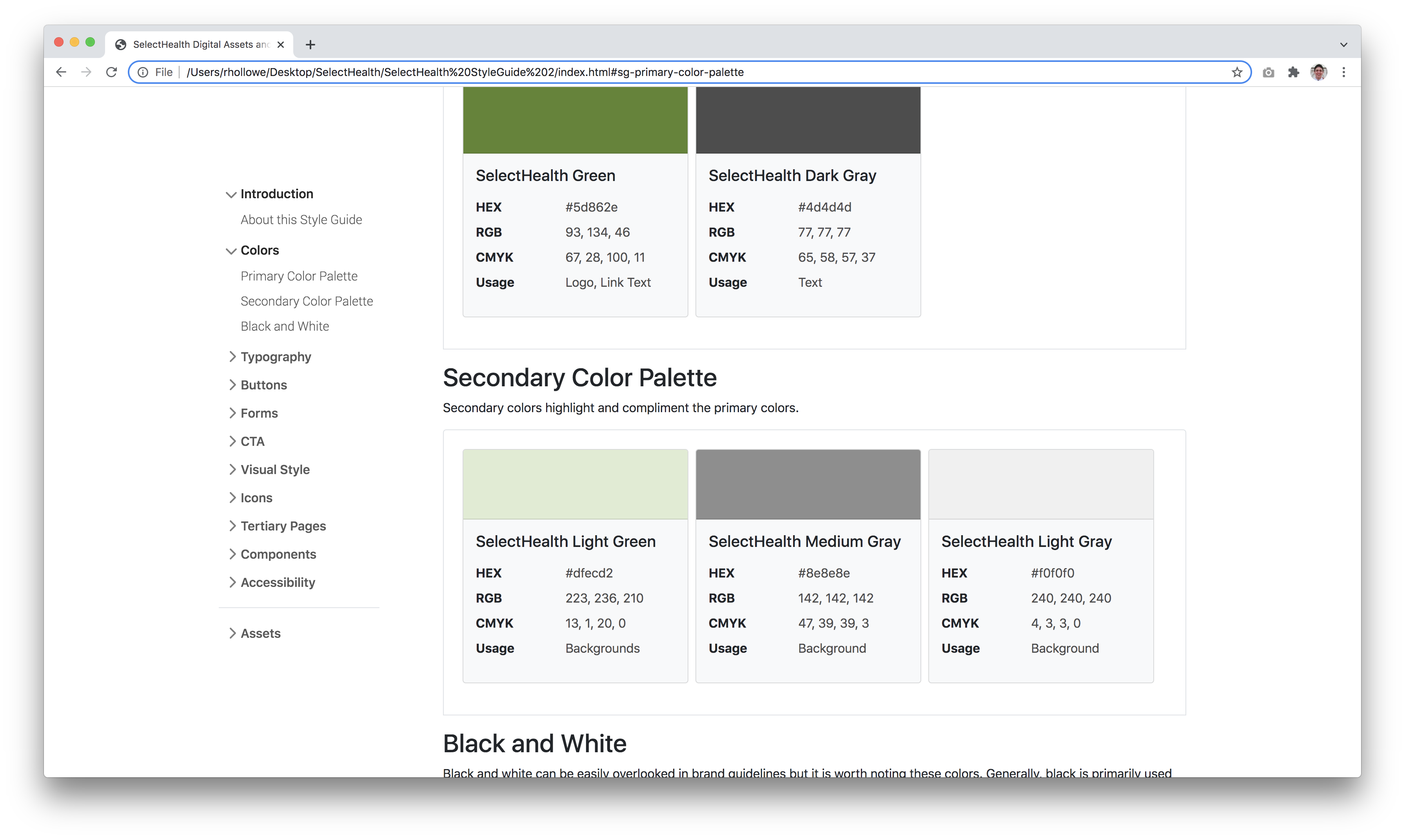 Color Schemes
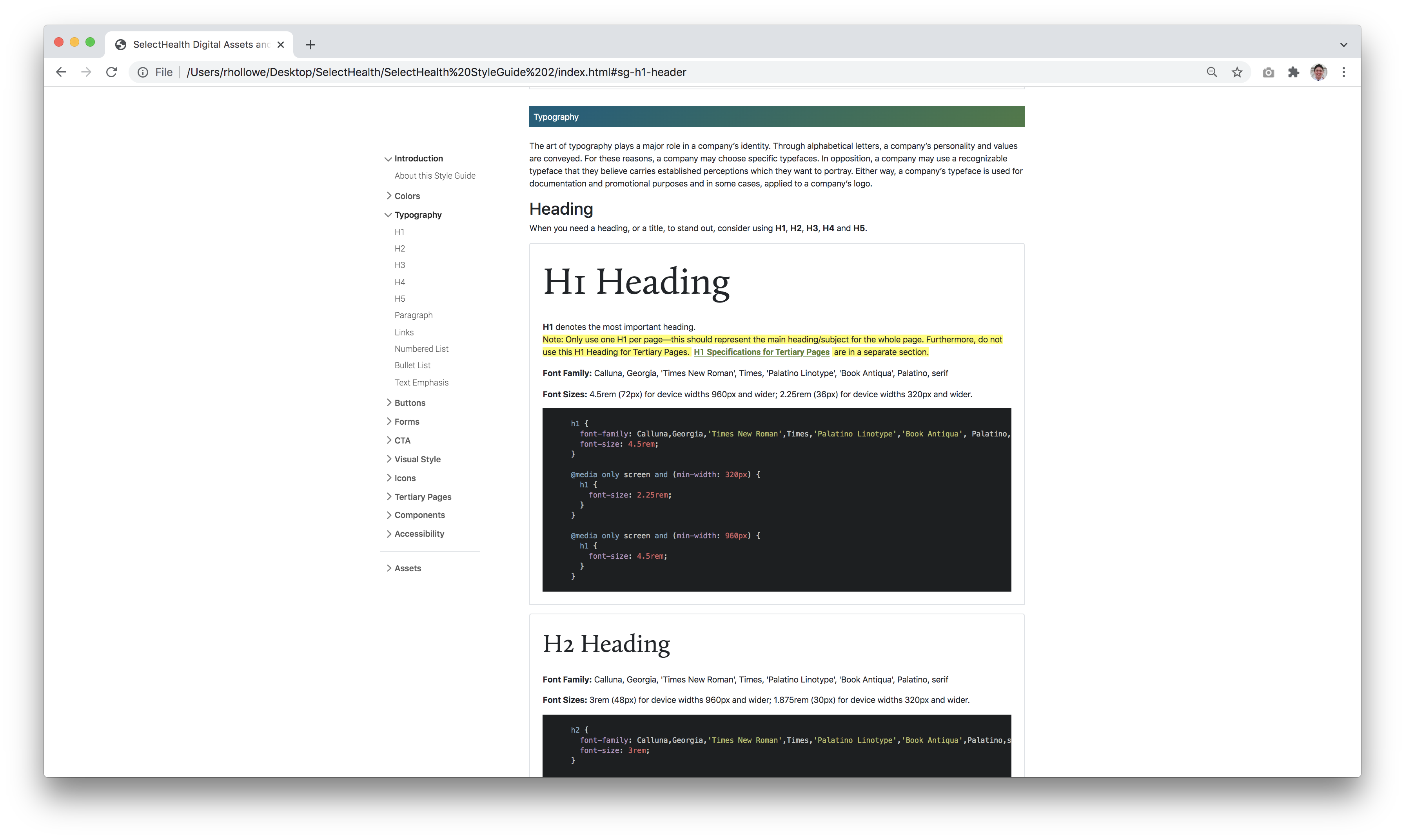 Typography
Overall, the stakeholders loved the look and feel of the website and that it was cohesive with marketing materials. Including the use of SelectHealth colors to represent the company throughout the website.
Deliverables
Though brainstorming and the user research, the stakeholders and I determined the following outcomes for the project:
- Conceptualize and develop a responsive mobile website to educate potential members.
- Allow members and potential members to navigate to the resources and information they are looking for easily and effectively.
- See an overall decline in calls to the customer service phone number.
I had freedom of all the layouts on the website although the design had to work inside of Sitecore CMS meaning that I had to create components. To keep thing simple, I wanted to create a number of reusable components that would work across the website to create a fun and professional design.
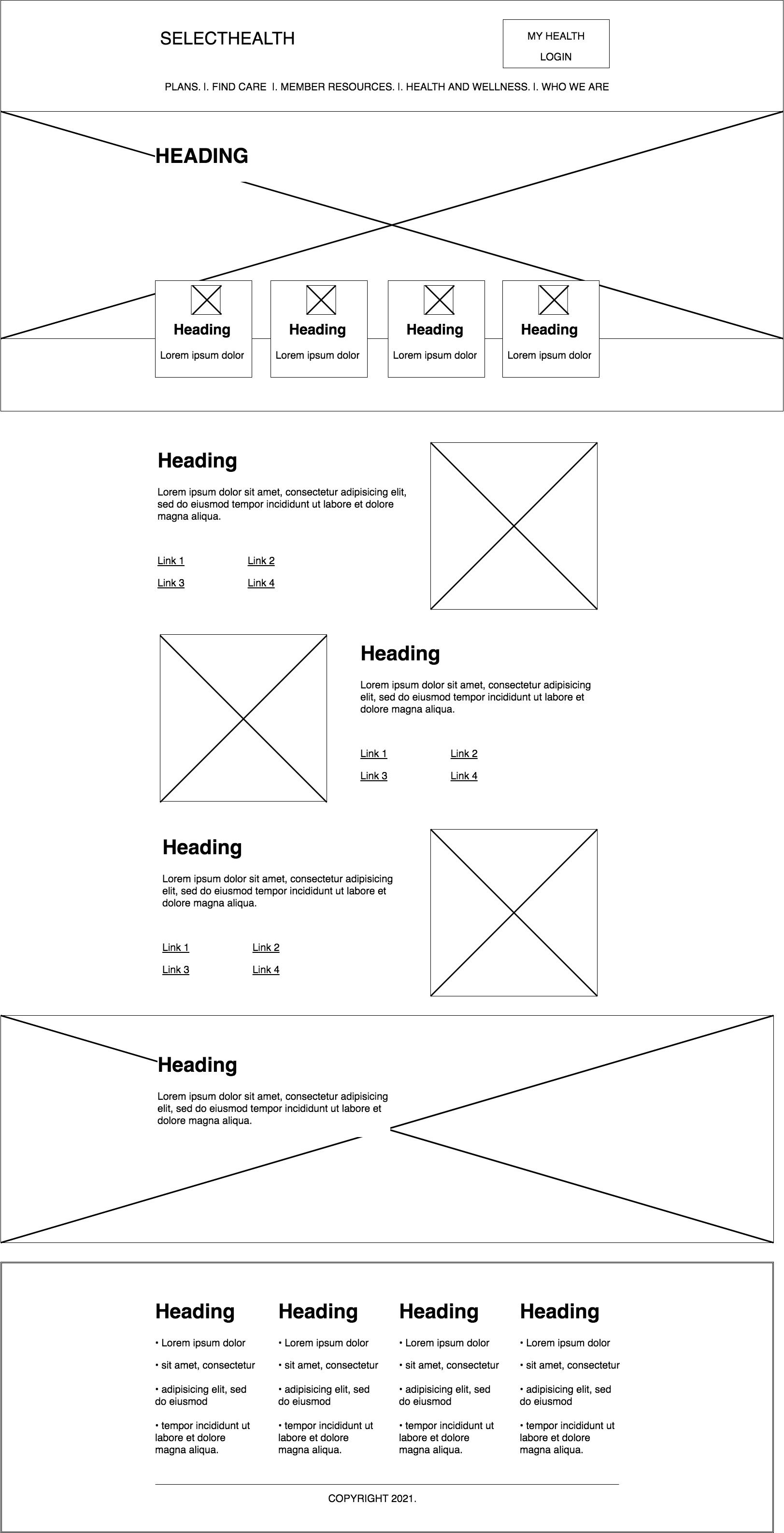 Desktop - Homepage Wireframe
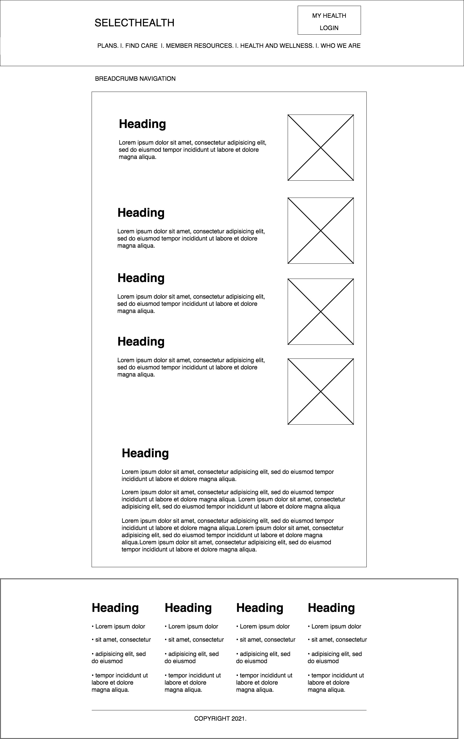 Desktop - Tertiary Page Wireframe
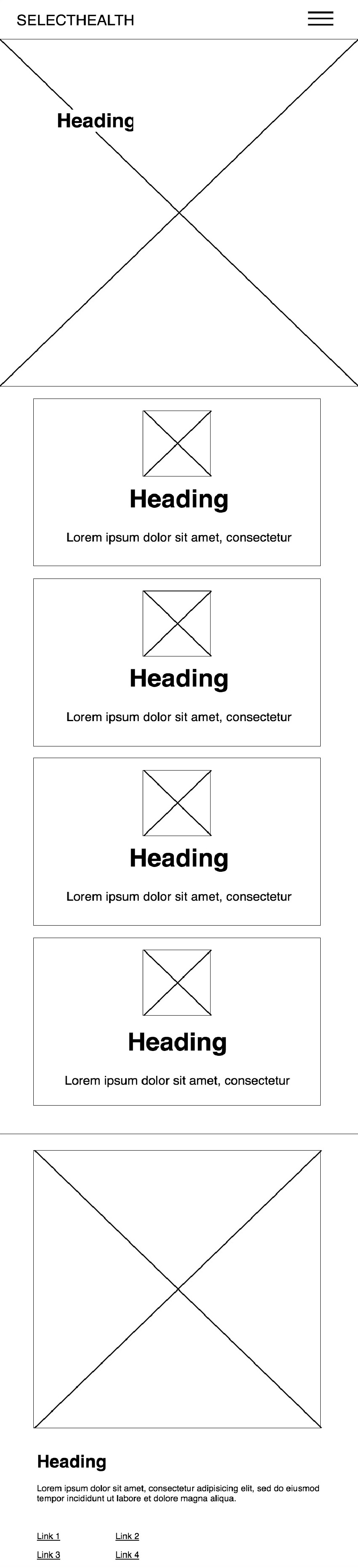 Mobile - Homepage Wireframe
Once the wireframes and overall aesthetic from the style guide/ design system were approved by the stakeholders, I moved on to hi-fidelity mock-ups and prototyping.
Hi-Fidelity Mock-Ups
I created mock-ups of the mobile and desktop components for the website in Sketch, Adobe Photoshop and Illustrator. After some pages were finished adjustments to some of the layouts were made to better fit the content supplied by copyrighters in marketing. Once that was approved by the stakeholders I began to fill in with icon and imagery.
The mock-ups that I created were then used for prototypes and user feedback.
 Desktop - Homepage Hi-Fidelity Mock-Up
 Desktop - Understanding Medicare Hi-Fidelity Mock-Up
 Mobile - Blog Hi-Fidelity Mock-Up
Prototype
I imported the hi-fidelity mock-ups to InVision to create the prototype. Not all of the details are featured in the prototype, such as hover states etc., but my goal was to present the most important elements to the users hoping to gain valuable feedback.
The prototype was used in conjunction with a number of tasks to gain valuable video feedback from a group of users. This allowed us to make small changes to the layout where people appeared to be struggling with the tasks before starting on development.
Coding Website
Front-end templates for the components were coded in CSHTML, CSS and Angular. I coded these in conjunction with the developers so the team would meet the deadline for the website to "go live".
The content was then added inside the CMS after the back-end development was complete.
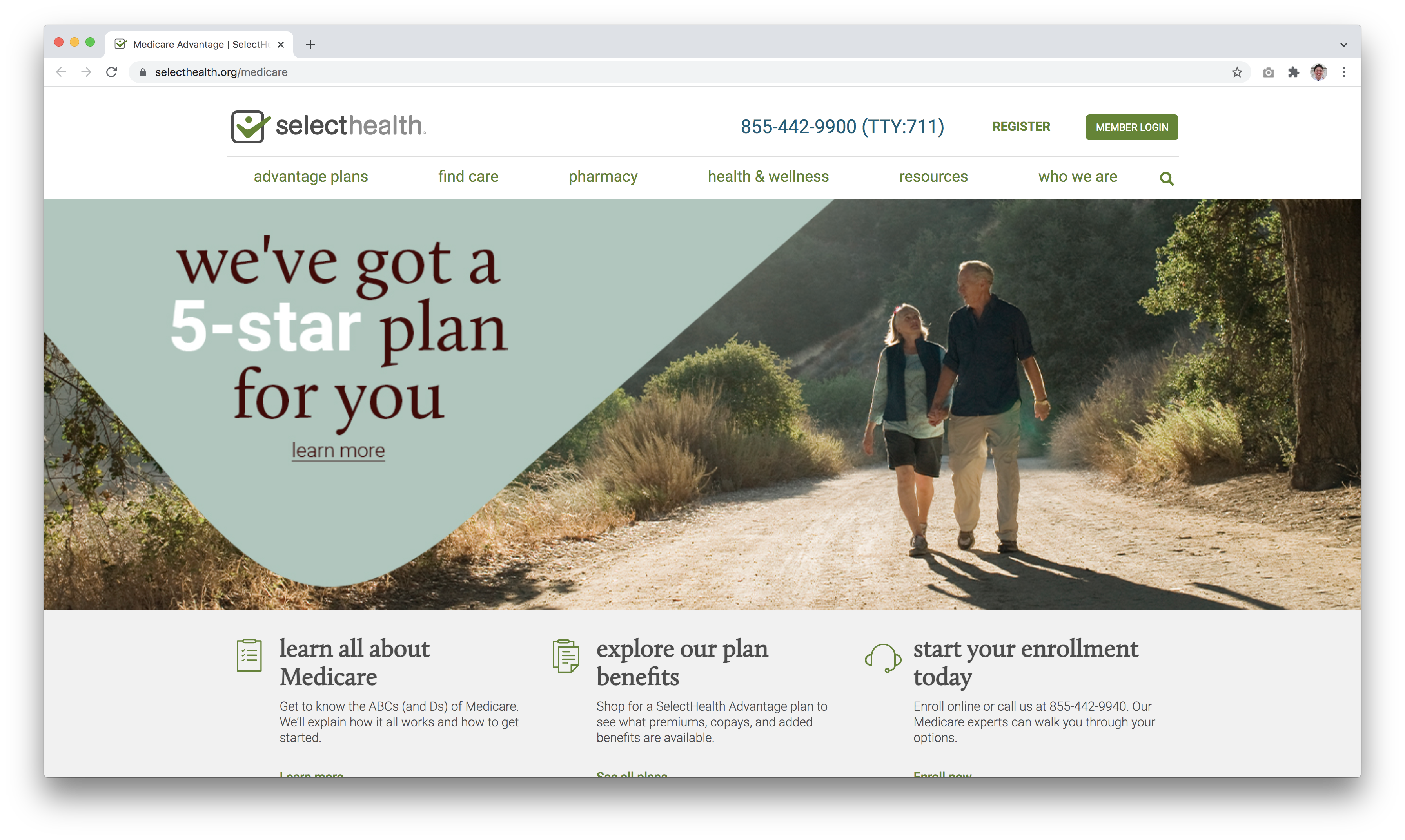
Here is the link to the website: https://www.selecthealth.org
Final Thoughts
The stakeholders were very satisfied with the deliverables that were met by myself and the team overall.
I believe, there is always room for improvement and the next steps are to conduct further user testing and make adjustments to the website based the feedback and analytics.
I learned that continuous feedback throughout the project and involving developers early on in the design process is very helpful. Doing this helped me understand the limitations of the development team and sitecore CMS allowing me to create a design that could be executed without any major problems.
I was really happy with the outcome of the website and the feedback received from the team. Overall, we have seen an increase in people engaging with the website.
Get in touch
-
Social
©2022 Raymond Hollowell. All rights reserved.